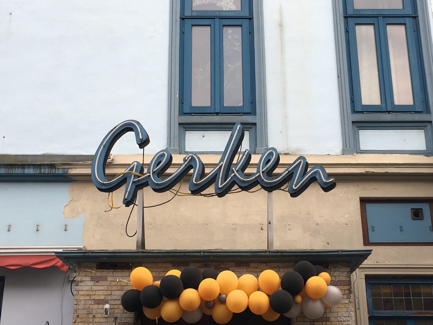
Mistral
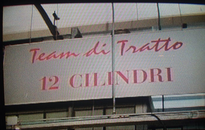
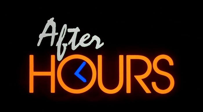
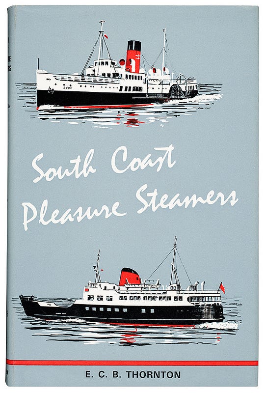
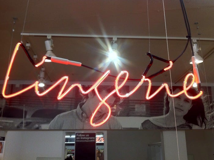
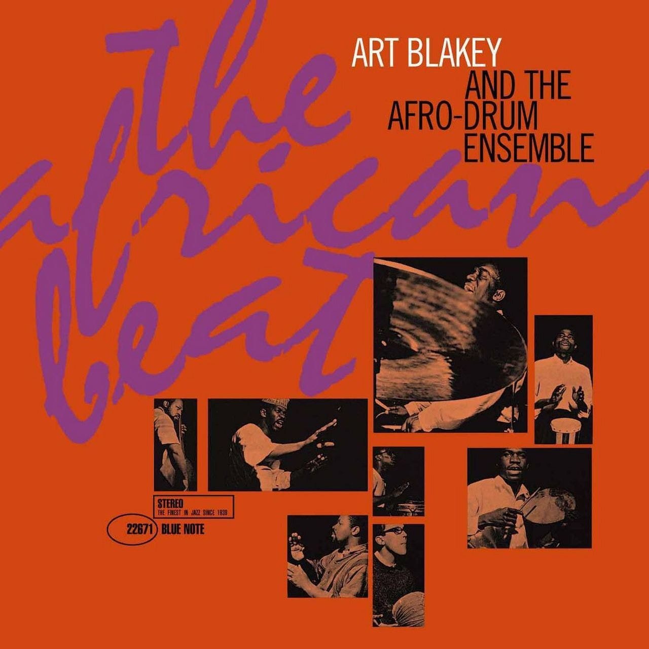
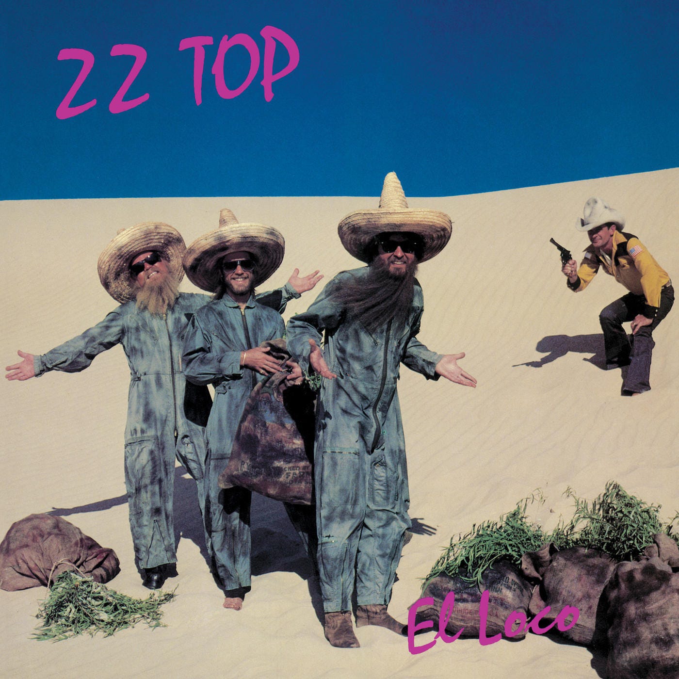
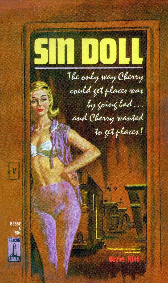
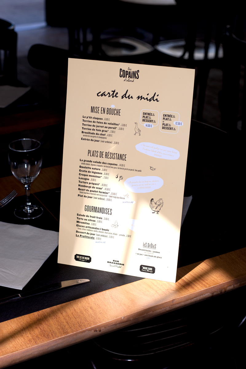
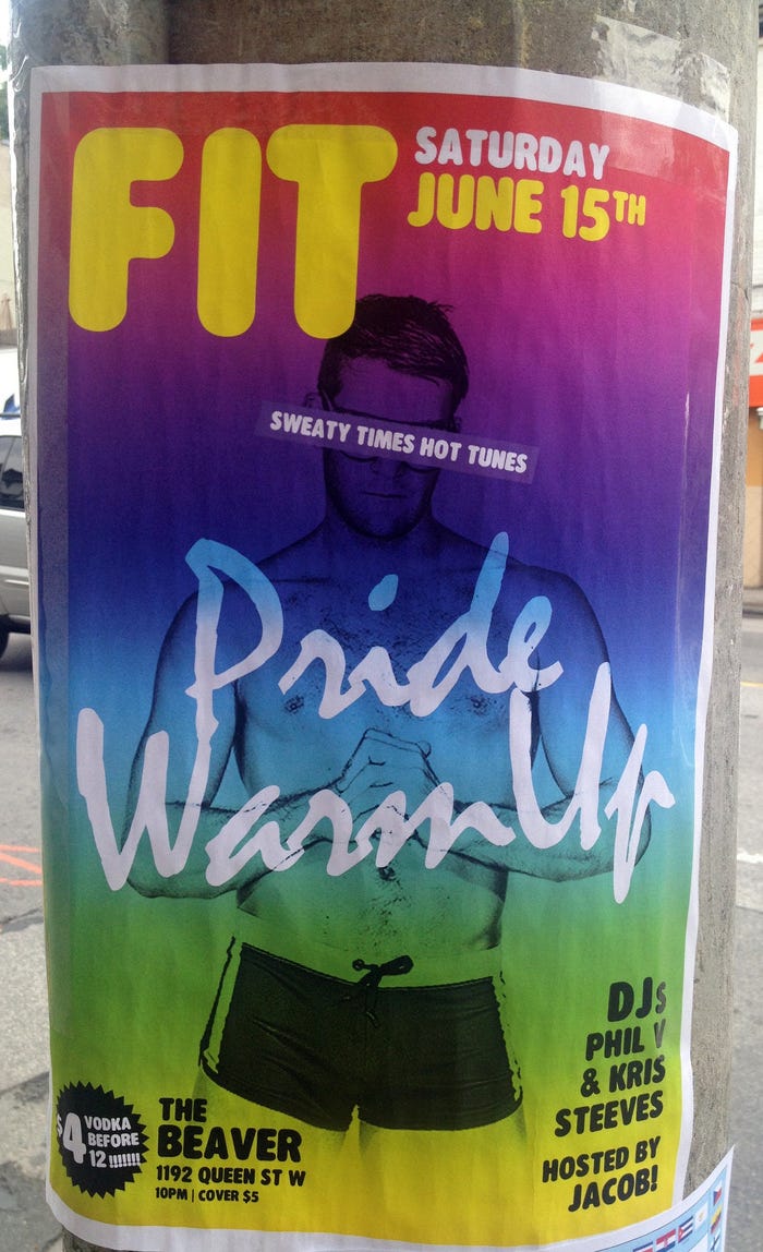
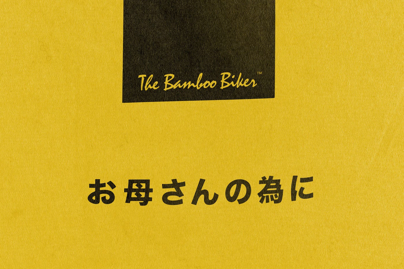
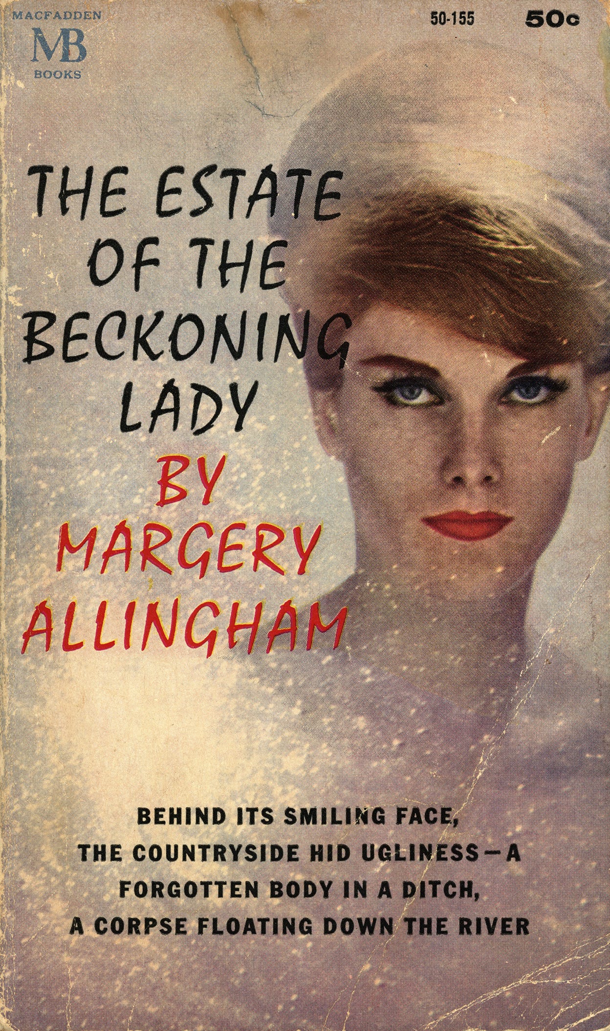
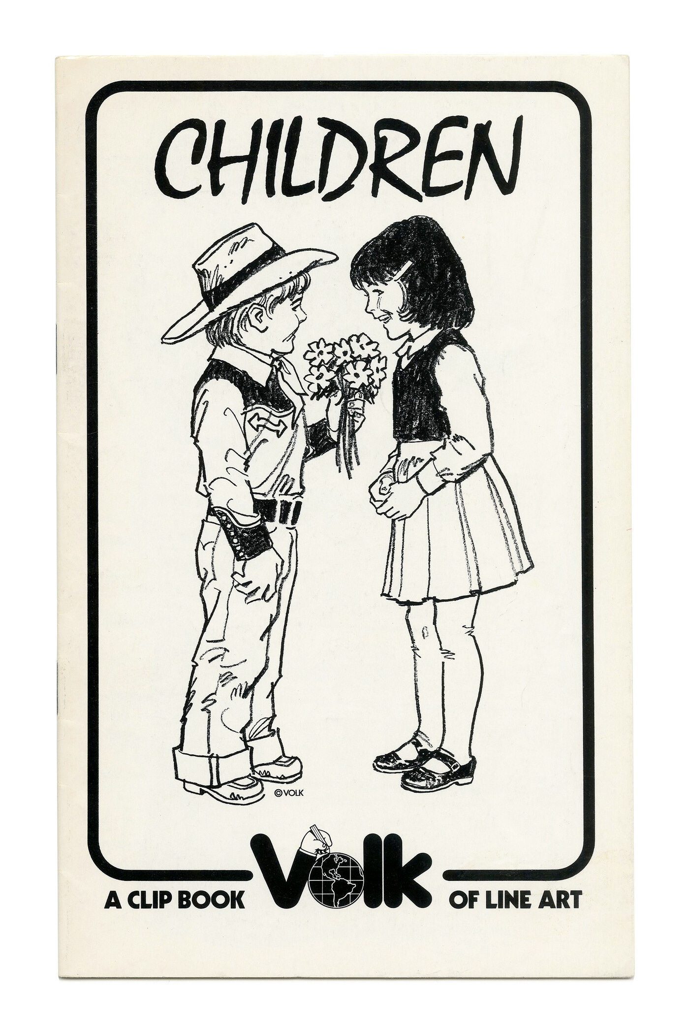
Many fonts evoke a writing implement, as if jotted down by a calligrapher’s nib, typewriter, receipt printer, or crayon. But Mistral - sultry, silly, serpentine Mistral - evokes a room number written in lipstick on a cocktail napkin, slid across the hotel bar to the handsome stranger drinking alone. And Mistral’s magic is that you can swap out the faces and places in this story and it still makes sense: that cocktail napkin could be all that’s standing between two achingly attractive actors in a Mad Men episode, or two wrinkled divorcees on a Swingers Cruise docked off the port of Tallahassee.
Mistral is winking. Mistral is on vacation. Mistral is in Amalfi, Mykonos, Nice. But don’t be intimidated - Mistral is just as happy in Cancun, Daytona Beach, The Sandals Inn. And yet still, Mistral is in post-war Paris, sharing cigarettes with American soldiers in second-rate jazz bars. And ‘80s road-side honky-tonks. And on the label of Taylor Swift clip-on earrings at Claire’s. Because while Mistral has style, panache, and confidence, it most importantly does not take itself seriously. It is interested, primarily, in having a damn good time.
Someone with bad taste would find Mistral elegant and demure. Someone with self-conscious I-must-prove-my-coolness taste would find Mistral corny. But for decades, designers have loved Mistral for all the right reasons. They know that like a good dream or a childhood memory, Mistral is better left unexplained and unjustified (unless done in a quite tasteful font Substack, of course). They know that mistral is best when it is felt, enjoyed, assumed to be real, longed for.
And indeed, Mistral is often used as a typographic perfume. That is to say - sparingly, with an affect and a wink. It is used for subheaders, throw-away lines, phrases, quotes - typically between the headline and the body text. Mistral would never kiss and tell about all of this, but I would 😘


