Family
Fonts appear to be sui generis orphans, creations of their own vision. They're not. This issue will tag along with fonts as they head back home to their loving, inescapable families.

Technically speaking, a typeface is a collection of fonts that, while varying in height, width, weight, spacing, and slope, nonetheless share unifying visual themes. You can always arrive at one font by taking another in its typeface and pinching, pulling, yanking, or squeezing it.
Like siblings, fonts of a typeface will often finish each others sentences. They’ll have long conversations comprised entirely of inside jokes. Their voices match in pitch and cadence, having come together over the years like a string section tuning before an overture. They’ll talk over each other yet still hear each other perfectly.
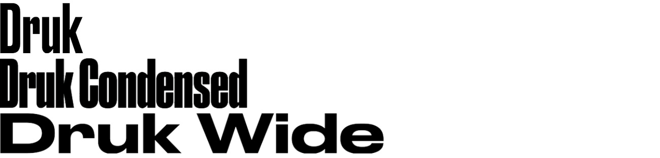
Take, for example, the Druks. They gab back and forth like bottles clanging in the recyling bin. "Conversation" isn't quite the right word for it. The individual voices are almost irrelevant. It's only through their syncopated clater that what they're really trying to say - "I love you guys" - comes through.


If the Druks are the Safdie brothers, the Syncros are the Coens. They are more measured and paced, giving each other space and letting their story breathe.


Crossing the language barrier
Even for our most literate friends, the sped-read-every-Harry-Potter-the-day-it-came-out Bar Trivia All Stars, there is a universally inescapable gap between seeing and reading. These milliseconds are a font's playground. This is when it establishes its way of being in the world: a posture and gait that you'd recognize from across the street with your glasses off. A pitch and laugh that you could make out in a Chinese restaurant on Christmas.
This way of being is a font’s “timbre.”
Timbre's immediacy is extralingual: while a font cannot speak every language, it can make itself understood regardless of language. To be clear, a font's timbre can only make itself understood. Not an arbitrary message - that would be speaking.
Typically that's a bit limiting. "Hi, I'm _______" is a name tag, not a conversation. But from time to time, fonts get to meet their foreign cousins: fonts with a inherited common timbre who, for one socioeconogeopoliticohistorico reason or another, ended up in a different language. This is when the sparks really fly.
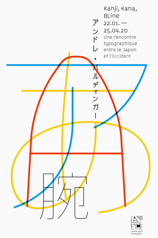
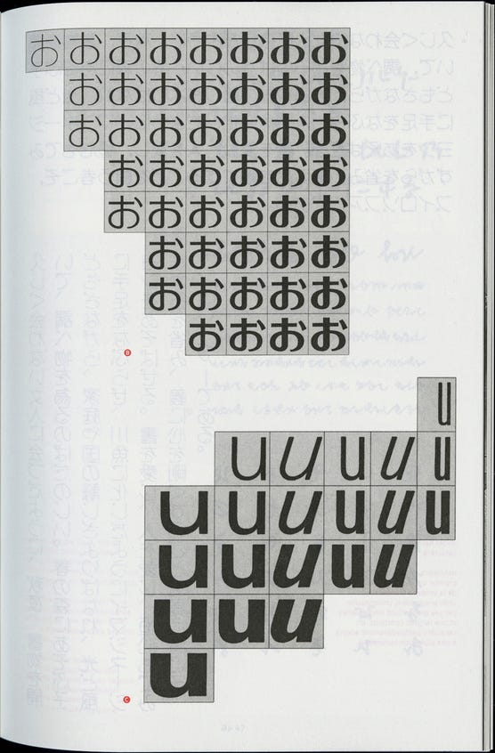
Below is a booklet for an exhibition studying the connection of kanji, hiragana, katakana and Latin characters in Japanese writing.
These writing systems converge like families seeing each other at the hotel check-in before a wedding. While you can immediately tell the American cousins, the Chinese cousins, and the Japanese cousins apart, there's a clear family resemblance.
To the left, the cover's austere characters speak like middle-aged siblings catching each other up on their travels. Their timbre: thin strokes with hemispheric terminals, patient arcs, tidy corners, airy spacing.
The characters to the right are their neices and nephews. They run around whispering secrets, bouncing off walls. And while they may be shouting aparent nonsense they somehow do it in lockstep, rising and falling together as if pulled by the same string.
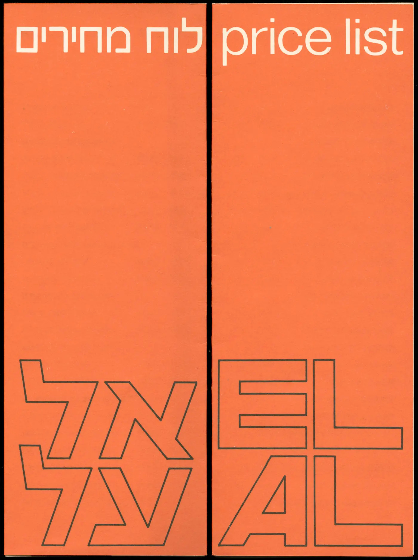
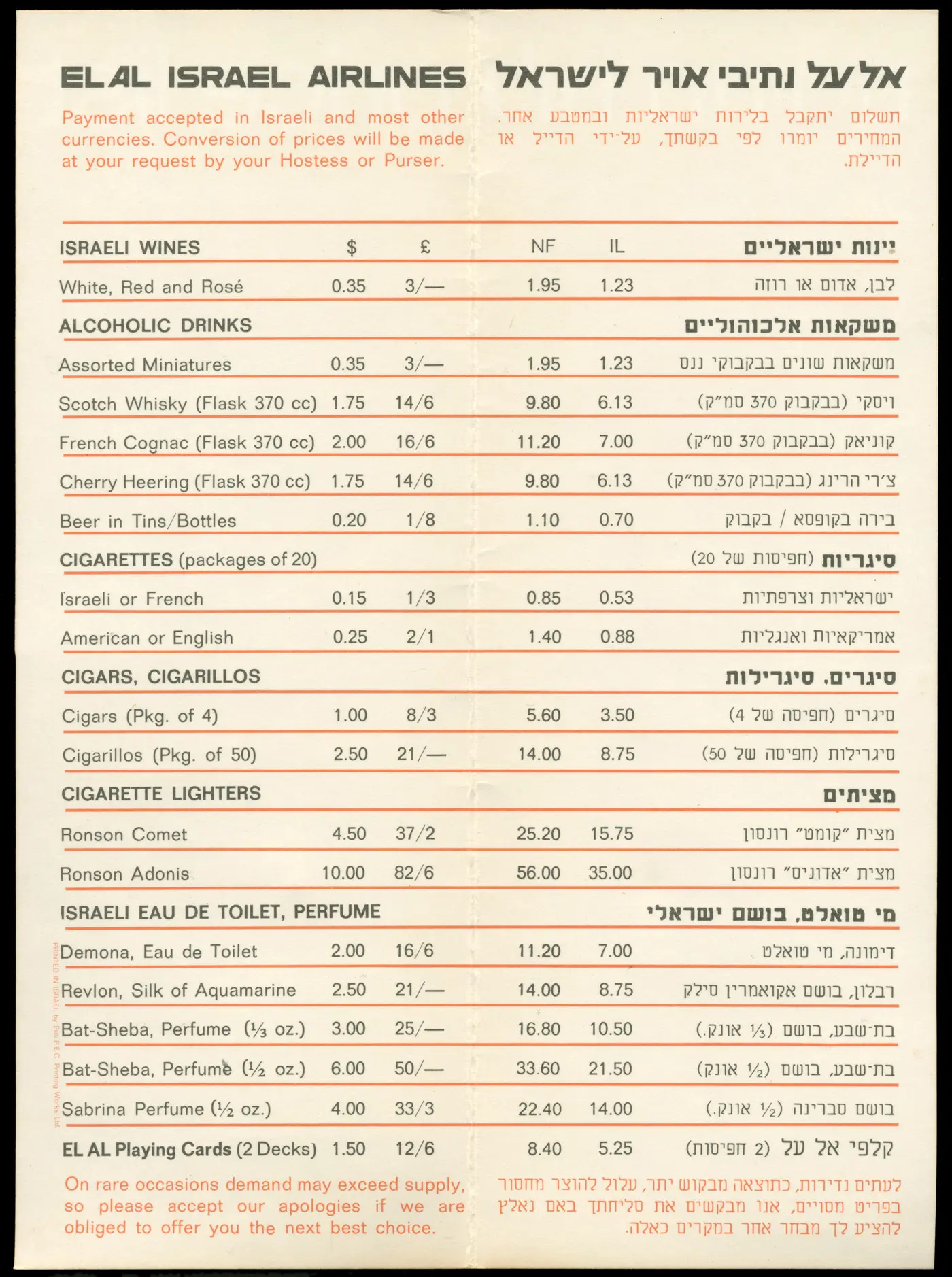
International font families often reflect their real geopolitics. Judaism is a historically diasporic religion, which makes Hebrew's survival all the more impressive. Its persistence has been thanks to its ability to assimilate into another culture without diluting its own. Take, for example, American Jewish literature, whose pages are typically split vertically like stone tablets: a Hebrew side and an English side.
Below is a 1970s inflight menu from El Al, Israel's national airline, shares that bilingual symmetry. The brand's entire visual identity was designed from the start to be inclusive and graceful in its handling of Latin and Hebrew characters. The Hebrew and English letters mirror each other perflectly in both the layout of the overall text and the composition of each letter.
Blur your eyes and ears and take in the menu and plane. Cut through the cigarette smoke and make out the accent found in Palm Beach, Haifa, Bensonhurst, and Munich. This is a melodic, heavy-throated voice millenia in the making.